
Colour as Guideline in Fra Angelico’s Work
El color como guía en la obra de Fra Angelico
Mecthilde AiriauSorbonne-Université, Paris, France
Compartir
> autores
Mecthilde Airiau
Ph.D at Sorbonne-Université , Junior Research Fellow at the Institut national d’histoire de l’art, Paris. M. A. in History of Art with Honors at Sorbonne-Université. Has participated in specialised dissertations and publications.
Recepción: 31 de mayo de 2023.
Aceptación: 6 de septiembre de 2023.
![]()
Esta obra está bajo una Licencia Creative Commons Atribución-NoComercial-CompartirIgual 4.0 Internacional.
> como citar este artículo
Mecthilde, Airiau; «Colour as Guideline in Fra Angelico’s Work«, caiana. Revista de Historia del Arte y Cultura Visual del Centro Argentino de Investigadores de Arte (CAIA). N° 23 | Primer semestre 2024, pp. 61-74.
> resumen
El presente artículo se propone evidenciar el modo en que Fra Angelico utiliza el color como herramienta para construir sus pinturas de diversas maneras: en sus obras, organiza el espacio y dirige la mirada hacia la parte más importante de la imagen, aumentando así la capacidad de la pintura para actuar como herramienta de predicación. Este uso del color pretende conectarse con prácticas retóricas como el ars memoriae. Este artículo se basará en tres ejemplos de la obra de Fra Angelico: el Armadio degli Argenti, la Coronación de la Virgen del Louvre y la Coronación de la Virgen de los Uffizi.
Palabras clave: color, predicación, construcción de imágenes, ductus, ars memoriae
> abstract
This article aims to show how Fra Angelico uses colour as a tool to build his paintings through various manners: in his artworks, it organizes the space and leads the eye towards the most important part of the image, thus increasing the ability of the painting to act as a preaching tool. This use of colour is to connect to rhetorical practices such as the ars memoriae. This article will be based on three examples of Fra Angelico’s work: the Armadio degli Argenti, the Louvre Coronation of the Virgin and the Uffizi Coronation of the Virgin.
Key Words: colour, predication, image construction, ductus, ars memoriae
Colour as Guideline in Fra Angelico’s Work
El color como guía en la obra de Fra Angelico
Mecthilde AiriauSorbonne-Université, Paris, France
Fra Angelico is known for both the softness and the vibrancy of his palette, which gives his work a heavenly dimension. Often discussed only from a sensory perspective (Fra Angelico’s soft or bright tones are pleasant to the eye) or to bring up (briefly) the painter’s palette, colour is thus considered a superficial element of the painter’s work: the topic has been discussed, but always from an indirect point of view. Thus, colour has rarely been dealt with as the main subject.
It can seem quite surprising, considering that since the publication of Vasari’s Vite, the historiographical tradition has recognized the painter’s qualities as a colourist.[1] Following Vasari’s footsteps, researchers continued to notice the liveliness of the painter’s colours and the subtlety of his palette without going much further. Mario Salmi’s works like those of John Pope-Hennessy and John Spike deal with colour only as a notable feature of the painter’s work that does not need to be studied further.[2]
There are, however, some interesting elements in the historiography. In his 1955 monograph, Giulio Argan studies the problem of Fra Angelico’s relationship with colour, detailing two periods in the painter’s work: in the first, light adheres to colour as a physical substance of a different nature; in the second, light and colour tend to integrate into each other. For Argan, this evolution is linked to the Thomist theory of colour as a degradation of pure light.[3]
Georges Didi-Huberman has also dealt with colour in Fra Angelico’s work, analysing the “red spots” in the Noli me tangere in the Convent of San Marco and the marmi finti in the Madonna of Shadows in the same convent. He examines this category of signs that eludes iconography, concentrating almost exclusively on studying these patches of colour. He concludes that these areas signify transcendence, playing on the opposition between the figurative and the “dissimilar”.[4] This question was taken up again by Timothy Verdon in 2015. He added a few context elements to Didi-Huberman’s analyses, particularly the Florentine taste for hard stones.[5]
It should also be noted that with the definition of a “pittura di luce” at an exhibition organised in 1990 at the Casa Bonarroti in Florence by Luciano Bellosi, the study of a light trend in Florentine painting led to a more in-depth consideration of colour. Fra Angelico is considered part of this trend, and his work is reviewed in the exhibition catalogue from the angle of light and colour.[6] Neville Rowley took up this approach in his thesis defended in 2010. In it, he re-examines the term pittura di luce and examines the work of several artists, including Fra Angelico, in terms of light and colour. He notes that Fra Angelico’s work cannot be reduced to a particular style, as he was keen to renew his style for each commissioner.[7]
A contribution by Stefania Macioce in 2008 also sheds new light on the issue of colour in Fra Angelico’s work. The author attempts to summarize the question of colour since the early Middle Ages, taking Fra Angelico’s Coronation of the Virgin as her starting point. However, the article brings no new analysis as it is more of a review regarding the use of colour in Fra Angelico’s work.[8] Cyril Gerbron, in his doctoral thesis, Liturgie et mémoire dans l’œuvre de Fra Angelico published in 2016 and in several articles before that, explores the painter’s use of colour from the angle of ornaments and liturgy. For him, in Fra Angelico, colour is a means of signifying Paradise.[9]
Thus, it is evident that while the question of colour is widely discussed in Fra Angelico’s historiography, it has rarely been treated for its own sake. Its pictoriality and its place in the construction of the image have yet to be studied. Two things have probably caused this lack: the understudy of colour as a pictorial element in mediaeval art and art history in general, on the one hand; the focus, in Fra Angelico’s studies, on attributing and dating the artworks, on the other hand, leading to a lower interest in iconographic and stylistic studies.[10]
However, Fra Angelico employs colour not only to make the image pleasant to the eye or to induce the spectator into a state of contemplation. It is not merely ornamentation or an element of decorum,[11] but it is used to build the image and to order its reading. In Fra Angelico’s paintings, colour is a tool for reading images: it constructs the composition, arranges its different parts, and unifies it. A single image can thus be summed up by its dominant colour, which crystallises its discourse. To this day, this point has not been explored, even if colour plays an essential part in the efficiency of Fra Angelico’s paintings. I therefore propose to examine how this construction is set up in three of the painter’s artworks: the Armadio degli Argenti, kept in the Museo di San Marco, and two Coronation of the Virgin, one kept in the Louvre and the other in the Uffizi Gallery.
The Armadio degli Argenti
The connection between the construction of Fra Angelico’s paintings and the arts of memory was well demonstrated by Cyril Gerbron. The Dominican order did much for the diffusion and posterity of the mode of memorization by making significant use of it. Thomas Aquinas also made this technique a part of the virtue of prudence and thus enormously influenced the thought of ars memoriae.[12] As a Dominican friar himself, Fra Angelico must therefore have been more than aware of the technique and its applications.
Those arts, practised since antiquity, maintain a very particular relationship with the notion of image. The technique of ars memoriae involves retaining a series of images in a precise order, being able to situate them within a series and to go through them in any order and from any point. It is based on the memory of well-known places, termed loci, to which the memorized elements, known as imagines, are associated. The succession of these loci enables us to seize the imagines according to a precise order. To reinforce the course’s cohesion, it is recommended to create links between the images, as can be seen in artworks.[13] The use of colour plays a determining role in this construction, as we shall see. In that regard, the Armadio degli Argenti is an enlightening example.
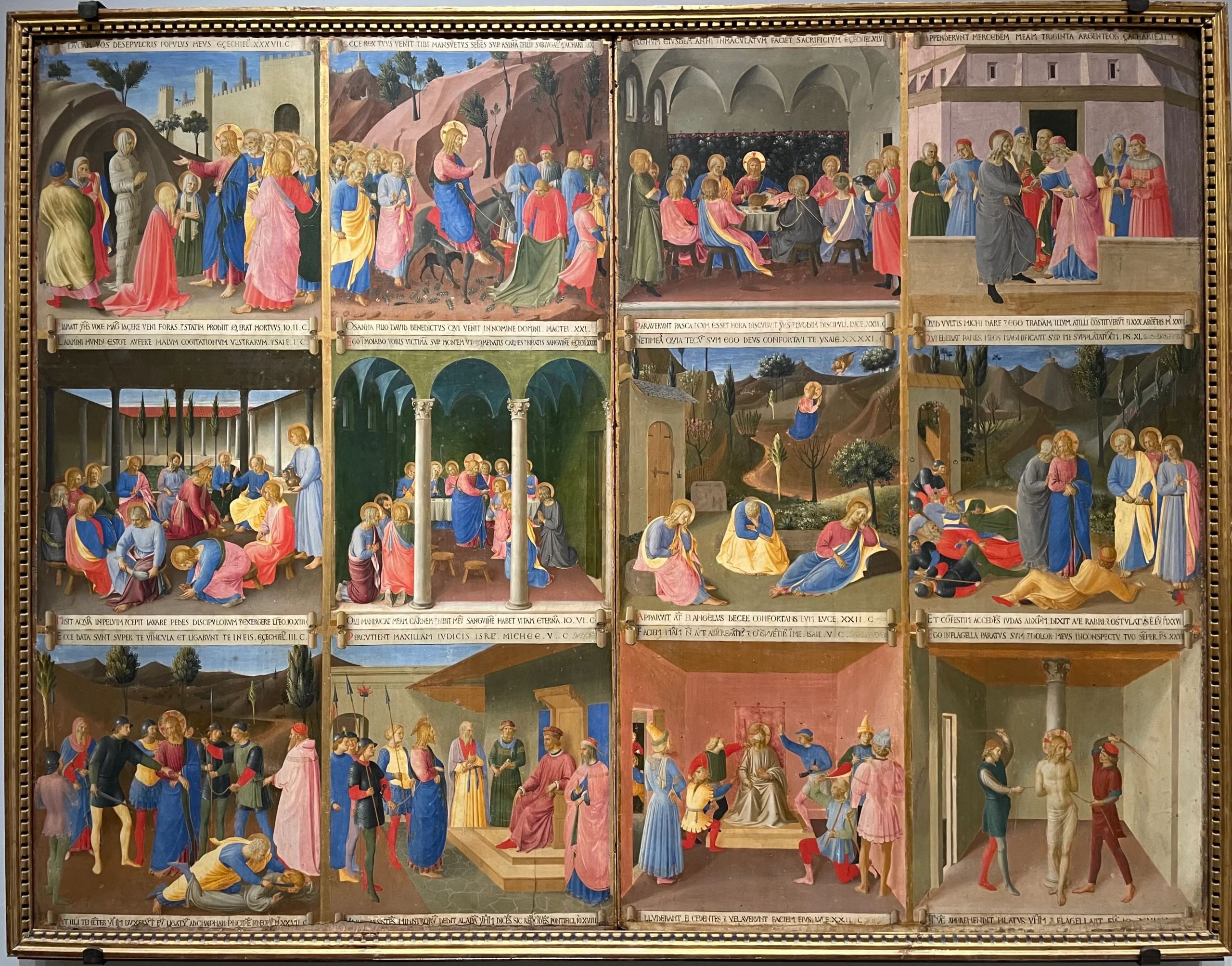
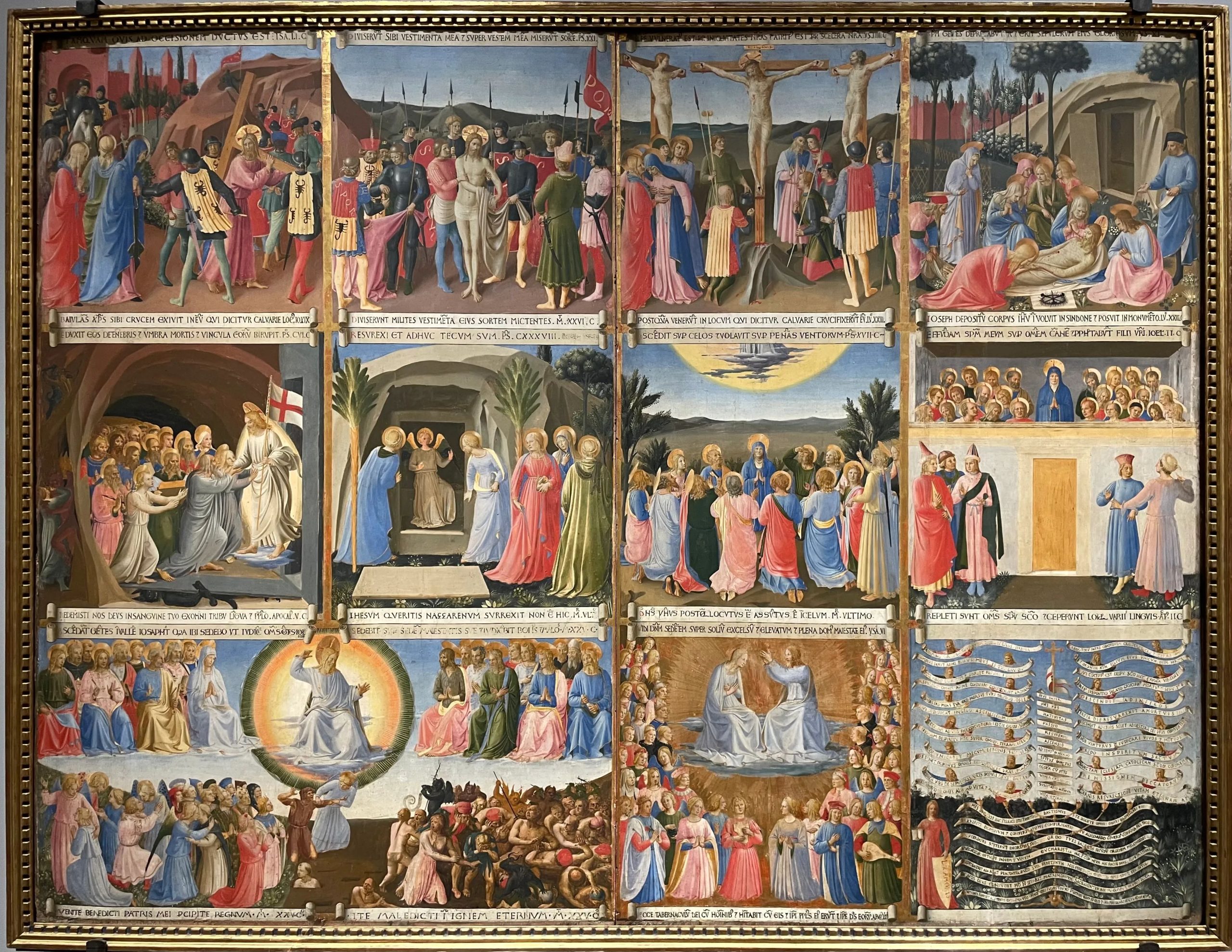
The work is remarkable in being a set of images in tempera on wood which constituted the four panels of the doors of a reliquary of the church of the Santissima Annunziata (Fig. 1 to 3). Only thirty-two of the forty pieces commissioned have survived.[14] The church of the Santissima Annunziata preserves on the reverse side of its facade a fresco representing an Annunciation considered an acheiropoieton from the second quarter of the 14th century: according to tradition, the face of the Virgin Mary was painted there by an angel. The Santissima Annunziata thus became a central church in the Florentine religious landscape. In 1440, Piero the Gouty, one of the sons of Cosimo de’ Medici, undertook a restructuring of the basilica’s architecture. He ordered Michelozzo to construct a baldachin enclosing the Annunciation behind gates. The chapel on the right of the fresco was also reorganized: it was intended for the offices of the Servite friars and Piero’s personal devotions. Piero also commissioned Fra Angelico to decorate the door of a reliquary located in a niche, which still exists, in the first left side chapel of the church.[15] The commission was prestigious as it was meant to shelter the silver ex-voto offered by the faithful to the Virgin. Its original aspect is unknown, but “it is known [to be] commissioned for a new oratory that Piero de’ Medici had built adjacent to the chapel of Sanctissima Annunziata and near the room in the convent where he had provided a spiritual sanctuary for himself in emulation of his father’s arrangements at San Marco”.[16]
Among the preserved panels, one bears nine images, the second twelve and the last one eleven.[17] The images of the first panel are Ezekiel’s Vision, the Annunciation, the Nativity, the Circumcision of Christ, the Adoration of the Magi, the Presentation at the Temple, the Flight into Egypt, the Massacre of the Innocents and Christ among the Doctors. The second panel presents the Resurrection of Lazarus, the Triumphal Entry into Jerusalem, the Last Supper, the Betrayal of Judas, the Washing of the Feet, the Communion of the Apostles, the Agony in the Garden, the Kiss of Judas, the Arrest of Jesus, Christ before Pilate, the Mocking of Christ, and the Flagellation. Finally, the last panel shows the Carrying of the Cross, Christ disrobed, the Crucifixion, the Lamentations over the body of Christ, the Descent into Limbo, the Holy Women at the Tomb, the Ascension, the Pentecost, the Last Judgment on a double panel, the Coronation of the Virgin, and the Lex amoris.
The amount of text that the last image contains is more than a little surprising. While textual elements are numerous throughout the cycle in the form of speech scrolls under each image, they take on an unusual importance in this image: we see two diagrams which are the “result of the combination of several materials appearing in the cycle of Ezekiel’s vision”.[18] The diagram in the upper part is borrowed from the Speculum theologiae, a text linked to Jean de Metz, a Franciscan of the second half of the 12th century. It consists in a table with the twelve articles of faith corresponding to those in the Credo. These are associated with the related prophecies, inscribed on phylacteries held by the prophets who pronounced them. The lower diagram is designed around the seven sacraments and linked to corresponding passages from the Old and New Testaments. The Lex amoris is the representation of the new Law, the Law of Love, established by Christ to fulfil the original Hebrew Law.
Cyril Gerbron highlighted the mnemonic dimension of the cycle in the last part of his thesis by hypothesizing that the images of the armadio are the projections of the imagines contained in Fra Angelico’s memory.[19] He arrives at the following conclusion:
Inventing images: for Fra Angelico, this activity of a meditative nature and directly linked to reading is necessary to assimilate the sacred text; it also constitutes the painter’s profession. In the cycle conceived for the Santissima Annunziata, these two aspects come together more than elsewhere. Each of his items is an opportunity to meditate once again on events that he had sometimes illustrated several times, and the recollection of the images already produced, in San Marco in particular, often appears. The specific context of this commission allowed [the painter] to create a composite cycle, the images of which are more or less close to mnemonic and personal images.[20]
Gerbron thus presents the cycle of the armadio as Fra Angelico’s personal meditation on the passage from the Old to the New Covenant, nourished by exegesis and theology.
Colour plays a crucial role in the mnemonic and meditative function of these images, as it allows the painter to link the various images together in several ways. First, the characters wear the same colours from one image to another. This iconographic convention within the work helps the viewer navigate throughout the panel without being lost among the large number of characters. It also differentiates the figures from one another.
Saint Joseph, for example, is always dressed in a yellow coat and a robe with a black hood, which makes him immediately recognizable in the five images where he appears.[21] In the same way, the Virgin wears a pink dress and a blue cloak with green lapels in nine of the fourteen images where she appears, which makes it possible to distinguish her from the other women pictured in the cycle. In the Ascension and the Pentecost, she wears a blue cloak with black lapels and a white wimple, which hides her dress. She appears all in white in the images that take place in Heaven, the Last Judgment, and the Coronation. The colours she wears thus allow us to link the different scenes together by giving them unity but also to distinguish the various stages of the cycle: her clothes are blue, pink, and green before the Resurrection, blue and white with a touch of black afterwards and all white after her death.
The process is even more striking where Christ is concerned: he wears a deep pink robe and a bright blue mantle in nine of the images where he is present, either as a youth or an adult. In the others, he wears either his pink robe (one image), or white clothes (four images).[22] He can also be wearing his perizoma (four images). The image in which he is dressed only in pink shows the Carrying of the Cross: the colour of the garment prefigures the Passion coming in the following image. It also shows the humanity of Christ –apparently stripped of all divinity (his blue cloak has disappeared)– which allows him to sacrifice himself for the sake of humanity. He appears dressed in white in the Mocking of Christ, the Descent into Limbo, the Last Judgment, and the Coronation of the Virgin Mary: those four images emphasize the kingship of Christ and his salvific role. He is dressed in his perizoma when stripped of his clothes during the Crucifixion and the Lamentation over his body: the white of a garment that barely hides his nakedness underlines the humility and the sacrificial dimension of his person. In a similar way to the Virgin, the colours worn by Christ give unity to the whole cycle by using a coherent chromatic system in which colours are repeated, while allowing the viewer to distinguish between the various stages of the sequence.
The colours are arranged to make the viewer’s eye pass from one image to another logically and gradually. The combination of red and blue is thus present in almost all images, and when it is not used, the two colours appear close to each other. Fra Angelico also demonstrates his ability to work within a relatively restricted range. The colour work of the Armadio degli Argenti is close to what can be seen in the predella of the Tabernacle of the Linaiuoli:[23] a few colours, no more than three, dominate the whole picture and connect the images of the predella, constructing thereby the chromatic unity of the artwork. This process is also used in the Armadio degli Argenti: Fra Angelico chose to use blue, red, and yellow as the dominant colours of the cycle. At least one of those colours is present in every image of the Armadio. The different images are not separated, the colours showing that they all belong to the same cycle and allowing a more fluid understanding of the whole.[24]
The Louvre Coronation of the Virgin
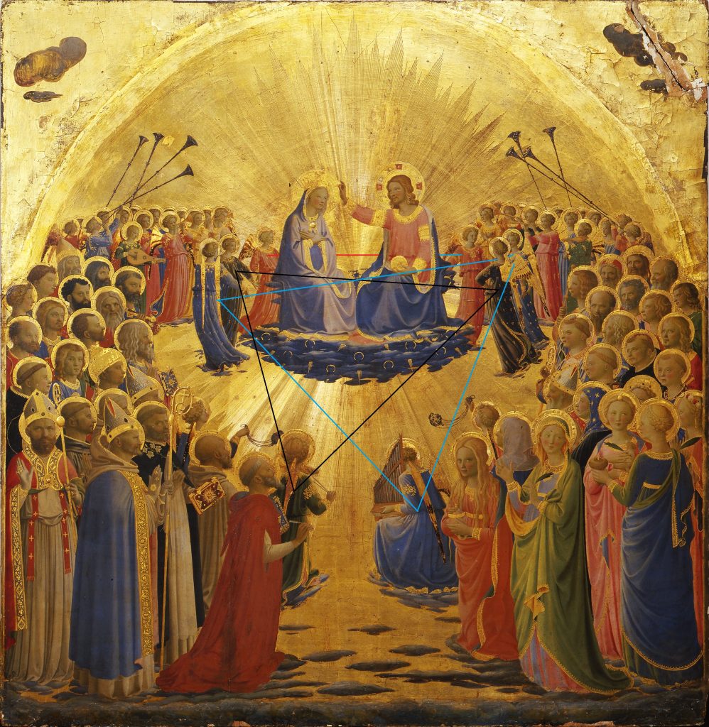
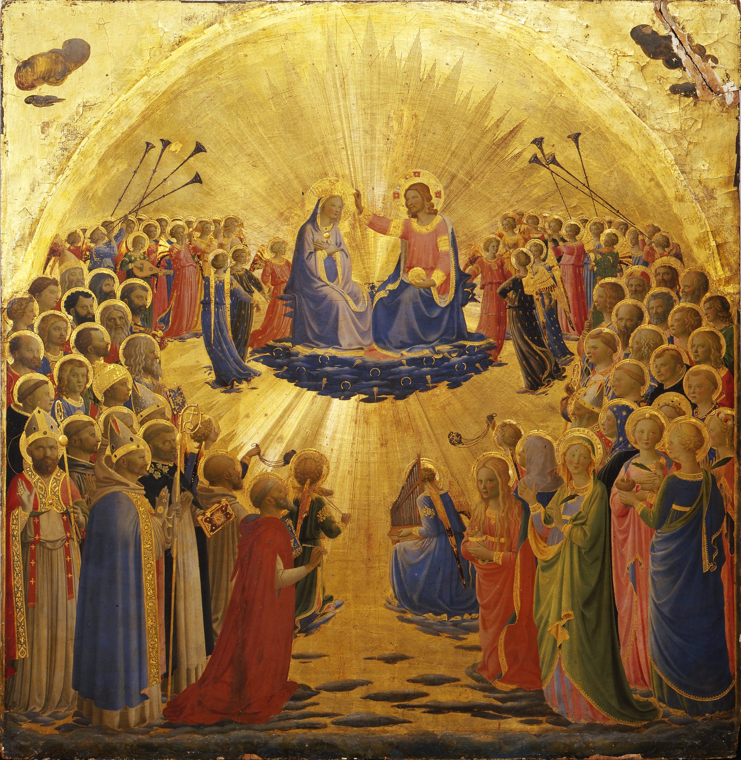
Unlike the Armadio, the Louvre Coronation of the Virgin is, if only its main part is considered, composed of a single image, particularly representative of the use of colour as a way of constructing the image, but in a slightly different way from what we just saw. In this artwork, the painter uses colour as a tool to construct the image and to guide the spectator’s eye to the most important part of the image as opposed to the Armadio, where colour guides it through different spaces. (Fig. 4)
The Louvre Coronation was probably painted around 1427–1429 for the Dominican Convent of Fiesole, to which Fra Angelico belonged. It was placed on the right of the rood screen and faced the Annunciation that is now at the Museo del Prado in Madrid.[25] In this painting, the impression at first glance is not of a methodically arranged composition, but rather of a disorganized crowd, yet in fact the painter establishes a rigorous order that emphasizes Christ and his Church. The importance and the representation of the ecclesial body was already highlighted by Cyril Gerbron in his doctoral thesis. His analysis of the image allows him to assimilate the Virgin to the Church itself as she is crowned by Christ: the characters are set in a place whose perfect architectural decor expresses the perfection of the divine world, a place where the glory of the saints and the Church is particularly emphasized. The emphasis is not on the universal dimension of the scene but on the glory of the event. Gerbron pointed out that the way the angels and saints are grouped “makes visible the unity of the ecclesial body”.[26] The closer the inhabitants of heaven are to Christ, the higher their rank is. Moreover, “the centre is favoured over the sides, the top over the bottom, and the right hand of Christ over the left”.[27] The saints are arranged according to the orders they belong to, namely patriarchs, apostles, martyrs, confessors and virgin martyrs; at their head, Christ, Caput Ecclesiae. More than a coronation, the altarpiece would then represent the triumphant Church, at the same time both earthly and heavenly. The choice to inscribe the scene in a material setting –in comparison with the Coronation of the Uffizi, which is set on a gold background– seems logical, but while the elements describing that setting –the blue sky and the architecture– are earthly, their perfection also sets the scene in the world above.
While this is an exciting interpretation, the colours worn by the Virgin, pink and blue, still present her as the mother of Christ: these are indeed the colours that characterise her as such in Fra Angelico’s painting.[28] However, this doesn’t prevent us from seeing in this altarpiece a glorification of the Church: in which case the Virgin would not be crowned simply as the mother of Christ but also as mater Ecclesiae, in line with the declaration of the Church Fathers. Very early on, they compared the human motherhood of the Virgin to her spiritual motherhood: in the same way that she gave birth to the Son of God, she gave birth to his Church.[29] For some, she even represents the mystical image of the Church intact in her faith.[30] Her position in space, at the same height as the rest of the crowd, seems to confirm this reading: the Virgin gives birth to the Church by giving birth to her son, but she is also part of the Church and thus remains a member of the body of Christ.
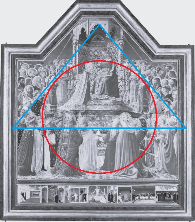
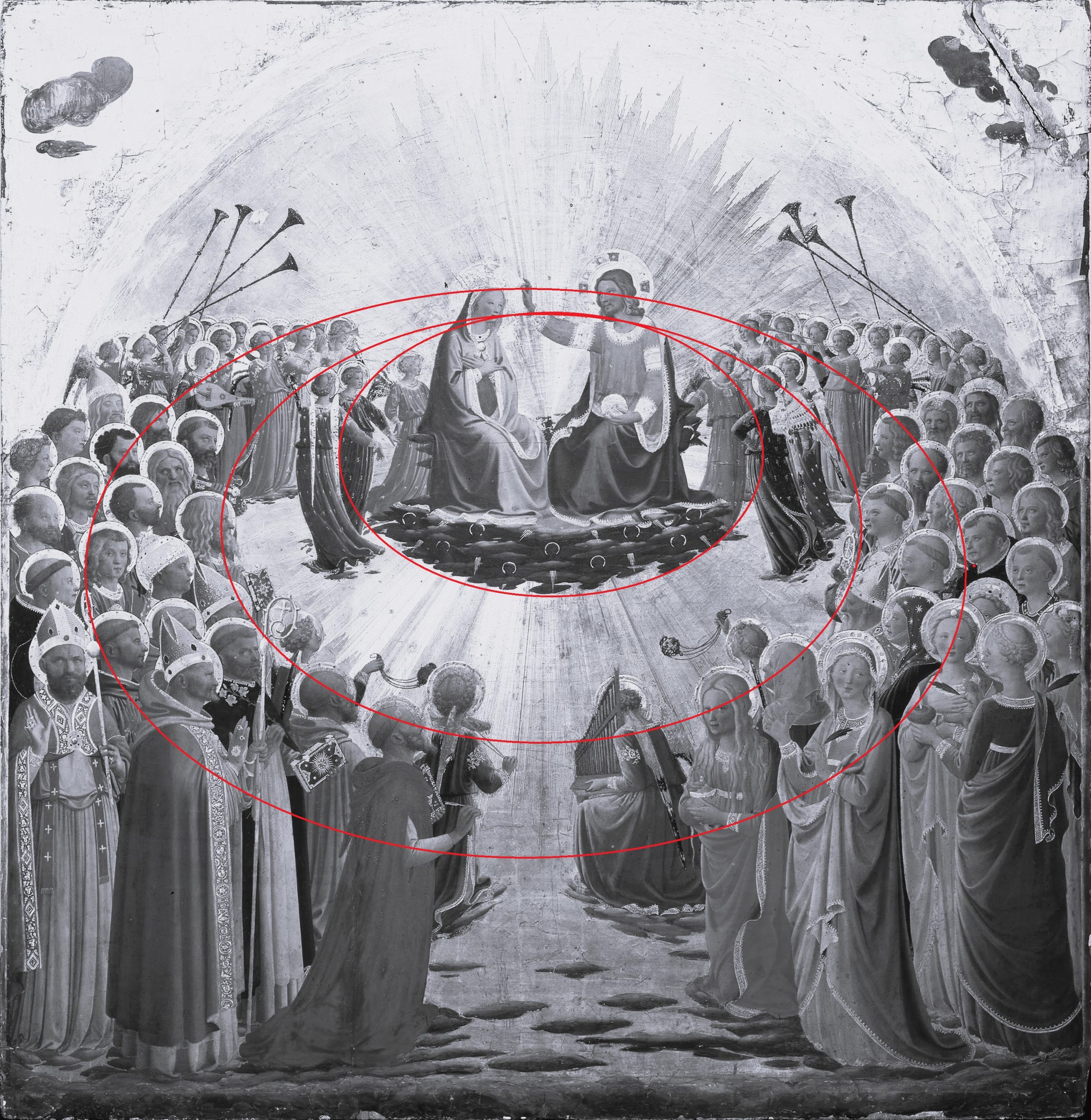
Together, all the figures of the painting form an ellipse, to which is added a triangle formed by lines traced by the heads of the figures in the foreground and the lines created by the figures positioned on the steps (Fig. 5). Behind this rigorous spatial construction, which is further reinforced by the presence of the staircase and the paving, other lines of construction, not as easily noticeable, are formed by the colours of the image and reinforce its meaningful coherence. The painter establishes a chromatic rhythm that allows the eye to lose itself in the crowd of characters without straying from the path marked out by the painter up to the couple formed by Christ and his mother. If the eye focuses on any of the colours in the altarpiece, it cannot but end upon the central scene. Our gaze is drawn to the green of Saint Nicholas’s chasuble in the foreground, then to the cloak of Saint Agnes on the right, then to the cloak of the starry-veiled saint, and finally to the seventh step of the staircase, and, following the movement of the staircase, to the Virgin Mary and Christ.
In the same way, the red of Saint Mary Magdalene’s cloak –one of the only bright reds in the painting– leads directly to the fourth step of the staircase, which again brings our gaze up to the stone canopy. It can also be seen that by linking the blue garments of Saint Louis and Saint Cecilia with those of the two angels framing the mother and son, two parallel lines trace a path to the central scene.
The elevated position of the altarpiece probably reinforced these dynamic lines since the viewer had to look up to see the whole scene. This is emphasized by the surprising double perspectival system: the first for the crowd at the foot of the steps and for the tiling on which they stand, and the second for the canopy under which Christ crowns the Virgin. This scene was designed to be seen by the faithful on their knees, like the saints at the bottom of the stairs. The steps leading to the throne and the baldachin are seen from below, while the Virgin, Christ and the walls of the baldachin are depicted as if the viewer were at the same height as them.
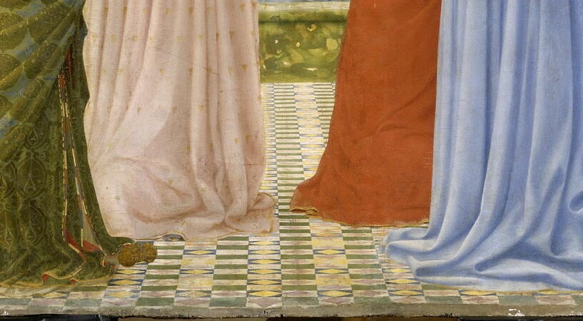
This is also accentuated by the arrangement of colours on the marble floor, consisting of coloured rectangles and rhombuses leading towards the nine steps. (Fig. 6) Fra Angelico alternates blue and yellow with beige, green and pink. Yet from a strictly optical point of view, those colours do not produce the same effect of depth: blue and green hollow out the surface of the painting and seem to sink into the pictorial space, while red produces the opposite effect, giving relief to the painting and seeming to emerge from it. Lighter colours, closer to white, produce a similar effect. The more intense the colours, the more those effects are accentuated. Therefore, the painter’s choice of colours for the tiling is far from insignificant: green and blue accentuate the effect of depth, while beige, yellow and pink temper it. Green and blue occupy a larger surface area in the tiling. The green of the tiles is in direct response to the marble of the first step of the staircase: when looking at the floor, the eye is almost directly drawn to this step and sinks into the picture. The impression of depth is thus significantly reinforced through colour: while facing the painting, the viewer sees a marble floor that sinks deep into the space until it reaches a flight of steps that ascend towards the central point of the scene.
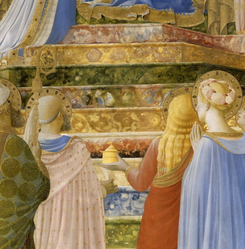
Colour is also used in this staircase to accentuate the sense of height of the throne in relation to the crowd contemplating the scene: all the colours present in the painting appear on it (Fig. 7).[31] The eye is therefore necessarily drawn to them, regardless of location. For example, if the eye is first attracted to the figure of Mary Magdalene, her bright vermilion dress, and her long golden hair, it will settle on the two steps at the same level as the saint’s head: one red and black, and one golden. Then, it will go up the steps one after the other, following one colour after the other: the sixth step from the bottom, just above the golden step, gathers all the colours of the other steps. After stopping on it, the eye is drawn to the top step, which contains gold, then to the seventh step, which is green and golden; then to the eighth, which is golden and pink; then to the ninth, which is red, pink, and blue, before finally settling on the blue coat of Christ. The painter makes the eye of the viewer climb the steps. This underscores the impression of height given by the couple formed by the Virgin and her son.
To those moving phenomena static lines are added to create the stability of the image (Fig. 8): the two angels dressed in pink just above the angels in blue form with the pink cloak of Bernard de Clairvaux an inverted triangle that encloses Christ and the Virgin. In the same way, all the blue touches form an ellipse surrounding the main characters of the scene, putting them at the centre of the image by pushing them downwards. The double perspectival system echoes a double dynamic created by the colour: the first one moves the gaze upward towards the Christ and the Virgin, accentuating their superior position in the image; the second one pushes it towards the centre of the pictorial surface. Christ is shown both as the head of the body of the Church and its centre and the Virgin as its mother and one of its members.
The symmetry of the whole, or at least a balance of chromatic forces, also reinforces the overall impression of stability quite effectively, although it does not appear at one to the spectator’s eyes. The colours do not answer each other linearly: a green element on the right side does not necessarily correspond to another on the left. Instead, the painter sets up a system in which saturation responds to clearness. To the blue coat of Saint Louis answers the lighter green of the coat of Saint Agnes on the left; the bright vermilion of Saint Mary Magdalene’s clothes corresponds to the light pink of Saint Bernard; the red brocade of Saint Augustine on the left is related to the lighter blue of Saint Stephen’s dalmatic on the right; the pink dalmatic and cloak of Lawrence balance the intense black of Dominic’s cloak. The image is thus perfectly balanced chromatically speaking, which contributes to the impression of softness which emerges from the work, mainly caused by the clear tonality of the whole image.
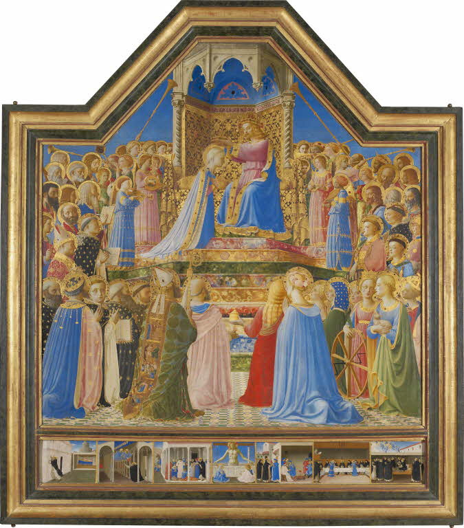
The Uffizi Coronation of the Virgin
Many similarities appear when comparing the altarpiece in the Louvre with the one in the Uffizi, which may have been painted for the church of the Santa Maria Nuova hospital around 1431–1435.[32] In both paintings, the chromatic range is somewhat restricted, but with an extensive variety of nuances and tones. In the Uffizi’s painting, the dominant colours, blue and red, are multiplied in different hues throughout the altarpiece (Fig. 9). As in the Coronation of the Louvre, the shades are distributed in a thought-out manner on the panel, giving an impression of many colours despite the small number of tints. Blue, for example, declined in four or five shades: one on the mantle of Christ, another on that of the Virgin Mary, one on the dress of the harpist angel, and the last one on Saint Lucia’s clothes. These nuances are themselves declined in different tones on the clothes of the saints. As always with Fra Angelico, there are no flat tints but delicate touches of colour that describe shimmering fabrics. The same phenomenon is observed for red, white, and green.
The only colour that is not diversified in different shades is gold. However, it never produces the same effect since it gleams and glints by dint of its metallic nature: the hue is never the same according to the viewer’s position and the light’s intensity. Moreover, this altarpiece, more than any other, must be pictured in candlelight: the colours would have changed more and the gold would have been more variable than what we’re used to seeing nowadays in museum rooms.
Indeed, unlike the Coronation in the Louvre, the scene in the Uffizi’s altarpiece stands out against an engraved gold ground. The Virgin and Christ are at the centre, surrounded by the celestial court arranged in an ellipse around them. There is no architectural decoration: the figures are standing on the clouds on which Christ and his mother are also seated. The entire gold background which, according to Cyril Gerbron, represents the “radiation in the process of happening”,[33] is delicately engraved with rays emanating from the couple formed by the Virgin and her son, creating a moving star on the surface of the background thanks to the play of light (Fig. 10). The haloes are engraved directly in the background, attenuating the sensation of depth created by the ellipse of the characters. Everything concurs to sublimate the moment of the coronation, suspended in time, out of time itself: the golden background freezes and inlays the scene in a non-physical place, Heaven, a place outside the world. According to Gerbron again, “Christ and the chosen ones are seen in weightlessness, in front of a golden surface which doesn’t create any place and doesn’t maintain a spatial relationship with the figures”. He points out that “gold is the light-as-medium where [these figures] evolve”.[34] The spectator would thus be in front of an instant frozen in eternity, as shown by the gold ground.
The question of eternity is one that Thomas Aquinas dealt with in-depth by reflecting on the relationship between an eternal God and a humanity who lives in time. The theologian writes that “in time, we distinguish the indivisible, that is to say, the instant, and that which lasts, that is time. However, in eternity, the indivisible instant always remains”.[35] Moreover, eternity is “all at once”, as opposed to time, which includes “a before and an after”. Time is “successive”, and instant is “essentially imperfect”: eternity which is “perfect”, excludes time and the instant.[36] It is therefore impossible to speak about an instant for the scene represented in the Coronation of the Uffizi: the scene is in Heaven and, therefore, in eternity. It is an event which paradoxically takes place at all times, a perfect event which doesn’t cease. This eternal dimension is undoubtedly what the gold background seeks to render: the Coronation is shown by the painter as an eternally present moment, which gives it a universal dimension.
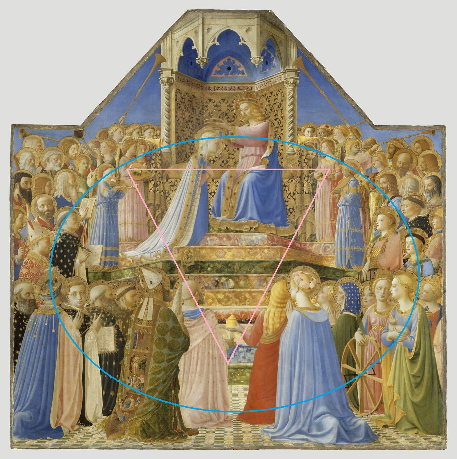
The colour also animates and organizes the image in subtle ways, effectively similar to those employed in the Louvre Coronation. The ecclesiastical hierarchy highlighted in the Louvre is absent in this image, and even if the angelic body is distinct from the saints, the crowd of saints is given prominence instead of the hierarchical body of the Church. The painting is composed of several concentric circles surrounding the Virgin and Christ (Fig. 11). Again, the colour arrangement reinforces this construction while stabilizing the whole image. This process is evident if we focus on the place of gold, more prevalent in this altarpiece than in any other painting by Fra Angelico. The haloes that encircle the heads of the saints create a double path for the gaze, one to the right and one to the left, leading to the central scene, as seen in the Louvre Coronation.
A double dynamic is also set up in this painting: the first one is created by the circles formed by the haloes and the heads of the saintly and angelic bodies; they surround the mother and the son and give a movement to the whole, undoubtedly subtle and discreet, yet very effective, nonetheless. The second dynamic stabilizes this movement: the rays engraved on the golden background cancel the effect of depth created by the circles of the characters; then, as in the altarpiece in the Louvre, the colour creates static forms that are in opposition to the movement described by the circle of the heavenly court. In this composition which seems to be all curves, angles create a framework in which the circles drawn by the characters can move freely. Two intersecting lines can be drawn by connecting the two blue-garbed and the black-garbed angels on either side of the Virgin and Christ. These two lines create a distance between the spectator’s eye and the mother and her son (Fig. 12).
The two angels in light red behind the Virgin and Christ also suggest a line that pushes the couple forward, thus tempering the effect created by the intersecting lines formed by the four angels in front. This complex construction is even more interesting if we note that those six angels form a circle around the pair: the movement created by the position of the angels clashes with the static lines created by the colour of the angels’ clothes. While the lines formed by the blue and black angels put the mother and the son at a distance from the viewer, these same angels form two triangles with the blue organist angel and the angel in black playing the vielle in the foreground, which bring mother and son to the forefront. Again, this tends to diminish the effect of depth created by the heavenly court. Christ and the Virgin seem to both float in a golden sky and to be placed on a golden background as if they were soaked up by the environment where they stand out.
As in the Louvre altarpiece, the chromatic rhythm orchestrated by the painter allows the eye continually to the pair formed by the Virgin and Christ. Here, red, blue and black play an interesting role: the eye is first drawn to the red cloak of Saint Bernard in the foreground on the right, then to Saint Mary Magdalene, then to the dress of Christ and finally to the whole couple. Blue lines also draw the eye to the centre of the altarpiece: the blue cloaks of Saint Augustine and the women in the right foreground can be linked to those of the Virgin and Christ. The black cloak of Saint Dominic can be linked to the robes of the angels on either side of the Christ and the Virgin, while Saint Martha’s cloak can be linked to the dress of the angels in black.
It is therefore on colours that Fra Angelico relied on to build the three paintings we have been looking at. Position, value, saturation: the painter considers every dimension of colour to balance his images and direct their reading. In these paintings, colour is a preaching tool which metaphorically guides the mind’s eye to look at Christ or to follow the succession of the image. This approach evokes a common concept in antique and mediaeval rhetoric: ductus. According to Mary Carruthers: “ductus is the way(s) that a composition, realizing the plan(s) set within its arrangements, guides a person to its various goals, both in its parts and overall”.[37] Ductus is interwoven with another rhetorical concept, varietas. According to Carruthers again, varietas is “a word covering many degrees of experience along a continuum between opposites, ‘too much’ and ‘too little’.” She adds that “the very imprecision of the measure is essential to its nature, for variety can never be only one thing”.[38] In Antiquity, it was inseparable from dignitas, –i.e., “worthiness”–[39] but by the Middle Ages diversitas –mixture and diversity– had become more important, to the point that Augustine “defined varietas as diversitas”.[40] Both concepts were crucial in mediaeval aesthetic and theology as they were the reflection of what takes place in the Incarnation – the union of God and the humanity (Bernard of Clairvaux speaks of a “mixture” that took place in the Virgin’s womb with the Holy Spirit as a pestle)[41] –and in the Church– both heavenly and earthly and of a great variety in its components.
The ways Fra Angelico uses colours can be seen as a pictorial application of ductus and varietas: as with an address, where style flourishes and rhetorical devices structure it and catch the attention of the audience to guide them towards the end of the argument, colours in Fra Angelico’s paintings organize the space and lead the eye towards the most important part of the image. In fact, in antique and mediaeval texts of rhetoric, the constitutive elements of the style of discourse are named colores; they are considered fundamental, “for one should never lose sight that all rhetorical activity is directed towards a clear goal, to persuade some people to some action. Thus, style was never thought of as superficial excrescences».[42] Colour plays the same part in Fra Angelico’s work. As with lines, albeit less ostensibly, it acts both as the core of the pictorial composition and as guidelines for its comprehension.
Notas.
[1] See, for example, André Chastel who wrote that «Vasari loves and praises in Fra Angelico’s work the very thing he condemns so often in principle: pure and vivid colours, large ultramarine areas, gold.», André Chastel dans Giorgio Vasari, Les Vies des meilleurs peintres, sculpteurs et architects, André Chastel (ed.), Paris, Berger-Levrault, 1989, p. 330. Personal translation.
[2] Mario Salmi, Mostra dell’opere di Fra Angelico: nel quinto centenario della morte (1455 – 1955), Vatican, Palazzo Apostolico, 1955; John Pope-Hennessy, Fra Angelico, London, Phaidon, 1974; John T. Spike, Fra Angelico, Milan, RCS Libri & Grandi Opere S.p.A., 1996.
[3] Giulio Argan, Fra Angelico et son siècle, Skira, 1955.
[4] Georges Didi-Huberman, «La dissemblance des figures selon Fra Angelico», Mélanges de l’Ecole française de Rome. Moyen Âge, Temps modernes, vol 98, 2, 1986, pp. 709-802 ; Fra Angelico. Dissemblance et figuration, Paris, Flammarion, 1990.
[5] Timothy Verdon, Fra Angelico, Milan, 24 ORE Cultura S.R.L., 2015, p. 92.
[6] Luciano Bellosi (ed.), Pittura di luce: Giovanni di Francesco et l’arte fiorentina di metà Quattrocento, cat. exp., Florence, Casa Buonarroti, May – August 1990.
[7] Neville Rowley, Pittura di luce. La manière claire dans la peinture du Quattrocento, Ph.D, Sorbonne-Université, 2010, under the supervision of Alain Mérot and Philippe Sénéchal.
[8] Stefania Macioce, «Il colori dell’Angelico. Tra esperienza mistica e consuetudini sociali”, Alessandro Zuccari (dir.), Angelicus pictor. Ricerche e interpretazioni sul Beato Angelico, Milan, Biblioteca d’Arte Skira, 2008.
[9] Cyril Gerbron, “Le Couronnement de la Vierge de Fra Angelico au Louvre entre expérience liturgique et expérience spirituelle”, Memorie domenicane, XLII, 2011, pp. 653-644; “Les Annonciations de Fra Angelico, Pollaiuolo, Piero della Francesca et Robert Campin : questions d’ornementalité et de couleur”, Studiolo, 10, 2013, pp. 58-73 ; Liturgie et mémoire dans l’œuvre de Fra Angelico, Ph.D Dissertation, under the supervision of Pr. Philippe Morel, university Paris-1 — Panthéon Sorbonne, 2012. The dissertation has been published under the title Fra Angelico: liturgie et mémoire, Turnhout, Brepols, 2016.
[10] On this question, see Gerardo de Simone, “Fra Angelico: perspectives de recherche, passées et futures”, Perspective. Actualité en histoire de l’art, 1 ; 2013, pp. 25-42.
[11] Ornamentation and decorum are here intended in their mediaeval meaning: “External beauty, adornment, lustre (in Latin decor) must suit (decet), in an aesthetic and axiological way, the eminence of the object or person to be honoured”, see Jean-Claude Bonne, “Les ornements de l’histoire”, Annales H.S.S., LI, 1996, pp. 43-45. Personal translation.
[12] Thomas Aquinas, Summa Theologica, IIa, IIae, qu. 57, art. 6.
[13] On this, see Mary Carruthers “Thomas Bradwardine, ’De memoria artificiale adquirenda», The Journal of Mediaeval Latin, vol. 2, 1992, pp. 36–38 and The Book of Memory. A Study of Memory in Mediaeval Culture¸Cambridge, Cambridge University Press, 2008.
[14] John T. Spike, Fra Angelico, New York, Abbeville Press Publishers, 1996, p. 79.
[15] Gerbron, op.cit, p. 301.
[16] Spike, p. 79. The author also sets a parallel between the cycle executed by Taddeo Gaddi for the sacristy of Santa Croce around 1335: “twenty-eight panels representing the lives of Christ and Saint Francis […] were inset into the upper part of a large credenza”. The parallel is interesting on a functional and iconographic level, but not only, as the use of colour is quite similar in both cycles.
[17] On the reconstruction of the Armadio and its potential iconographic sources, see Creighton Gilbert, Lex Amoris. La legge dell’amore nell’interpretazione di Fra Angelico, Florence, Le Lettere, 2005 and Concetto Del Popolo, “La Visione di Ezechiele del Beato Angelico”, Letteratura e Arte, 5, 2007, pp. 9-109.
[18] Gerbron, op. cit., p. 314.
[19] Ibid, p. 320.
[20] Ibid, p. 340
[21] It is interesting to note that the specific bright yellow Saint Joseph is wearing in the armadio is a constant for the representation of this figure in Florentine painting of the 14th and early 15th centuries. It is notably visible in the left wing of a little triptych by Bernardo Daddi kept the Berlin Gemäldegalerie, and in the Nativity of the San Pier Maggiore Altarpiece by Jacopo di Cione today in the London National Gallery.
[22] He also wears a white swaddle in the Presentation and in the Flight into Egypt, where the swaddle is covered by a red cloak.
[23] Fra Angelico, Linaiuoli Tabernacle, tempera and gold on wood panel, 1433, 528 × 269 cm, Museo di San Marco, Florence. On this artwork, see Marco Ciatti and Magnolia Scudieri (dir.), Il Tabernacolo dei Linaioli del Beato Angelico restaurato: Restituzioni 2011 e A.R.P.A.I per un capolavoro, exh. cat., Florence, Museo San Marco, 2011.
[24] This way of using colour as a tool to link the images finds an iconographic echo within the cycle with the motif of the door. Its function and signification have been analysed by Alessandro Zuccari. See Alessandro Zuccari, “Simbolismi medievali e forme rinascimentali: la “porta dischiusa” nell’arte dell’Angelico” in Beato Angelico. L’alba del Rinascimento, exh. cat., Roma, Musei Capitolini, April-July 2009, pp. 33-46.
[25] Diane Cole Ahl, Fra Angelico, Paris, Phaidon, 2008, p. 46. For Spike, the Coronation as well as the Annunciation “were certainly executed after 1430”. He adds that “a span of several years must divide the Annunciation, c. 1430, and the Coronation of the Virgin, which constitutes the most advanced display of linear perspective and anatomical foreshortening in Fra Angelico’s entire career” (Spike, Fra Angelico, p. 42). Pope-Hennessy dates the panel much later, around 1450, because of the “low viewing point”, a “system of projection [that] appears in Florence only in the fourteen-forties in Domenico Veneziano’s St. Lucy altarpiece”, John Pope-Hennessy, Fra Angelico, London, Phaidon, 1947, p. 34.
[26] Cyril Gerbron, Fra Angelico, p. 121. Personal translation.
[27] Ídem.
[28] See, for example, the Santa Trinita Altarpiece (Museo di San Marco, Firenze) or the San Domenico Altarpiece (Church of San Domenico, Fiesole), which was presented in the same church as the Louvre Coronation.
[29] See Augustin, De sancta virginitate, 6.
[30] Rabanus Maurus, De universo, 7, I, PL 111, 184 B.
[31] For an in-depth analysis of these steps and their colours, see Gerbron, Fra Angelico, op. cit., pp. 159–161.
[32] Pope-Hennessy, Fra Angelico, op. cit., p.195.
[33] Cyril Gerbron, Fra Angelico, op. cit., p. 136, personal traduction.
[34] Ibid., p. 137.
[35] Thomas Aquinas, Summa Theologica, I, 42, 2.
[36] Thomas Aquinas, I, 10, 4.
[37] Mary Carruthers, Rhetoric beyond words: delight and persuasion in the arts of the Middle Ages, Cambridge, Cambridge University Press, 2010, p. 200.
[38] Mary Carruthers, “‘Varietas’: a Word of Many Colours” in Poetica, 2009, vol. 41, 1/2, p. 11.
[39] The word is Carruthers’. She also writes that “dignitas and dignus, its adjective, are related to the verb de-cet, used when something is gracefully and fittingly adorned”, Carruthers, op. cit., p. 14.
[40] Ibid, p. 24.
[41] Quoted by Carruthers, op. cit., p. 30.
[42] Ibid., p. 14.